If the canteens on campus were intelligent…
How did the project start
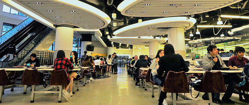
Despite the long-lasted online learning modes due to the pandemic, our campus of HKUST is still the base of living and activities for many of us. We hope to find out what on campus may be better for users (including us) to be intelligent.
Let’s do some needfinding
Our group started the project with a needfinding on what users of campus think that need to be “intelligent”. We went through semi-structured interviews with some students, realized that they were unsatisfied with the level of “intelligent” on our campus, and obtained multiple ideas on what to be improved on campus.
As the result, we obtained the following mindmap:
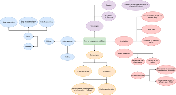
We decided to focus on the branch of catering service, as most of the interviewees mentioned the issues of canteens, and that is a part of the campus life that almost every university member would be involved in.
Next Step: What did the result tell us?
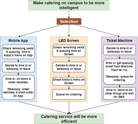
As we decide to go for a smart canteen, we moved forward to explore the details (and the issues inside) in the experience of canteens. Gathering our own experiences and information from the interviews, we created a GOMS. This reflected the fact that current methods of food ordering would all involve queuing, lowering the overall efficiency of getting the food.
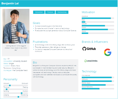
We also created personas for users and the management teams of the canteens on campus.
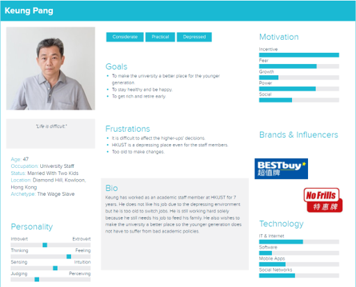
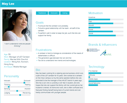
With these processes, we identified POVs –
- Some canteens users want efficiency in mealtime at different stages – deciding which canteen to go to and finish their meals.
- Some canteens users want enjoyment in mealtime, by finding favorite canteen and being able to gather with friends there.
- Restaurants hope to get ready, having proper estimation at customers’ demands and boosting the efficiency of completing orders.
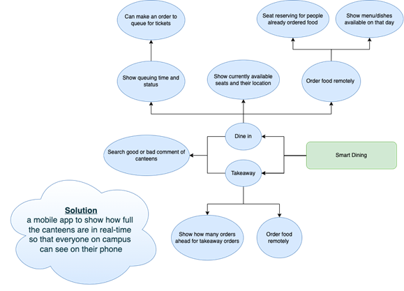
We came up with a mobile app solution to the issue – the core idea of all the POVs is the management of “supply and demand” – for dishes, seats, etc. – and an application can allow the flow of this information.
Designing the app
Our initial idea for the app is focused on the choosing of canteens, with the following storyboard:
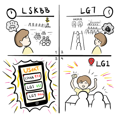
We then executed a round of speed dating with friends in HKUST to try finding out if such design would be sufficient for improvement of canteen experience. We received some key feedback:
- Finding a canteen with fewer people can be helpful for people in a hurry
- In timeslots like lunchtime, however, canteens are almost certainly full, and seat availability can be fast-changing. Here, the app won’t help much in this design
- Some additional functions can be added to help reduce the unnecessary time spent. For example, seat reserving and ordering may help!
- Newcomers may not be familiar with canteens here, and restaurants may hope to have a channel for communication with their customers. Can the app help?
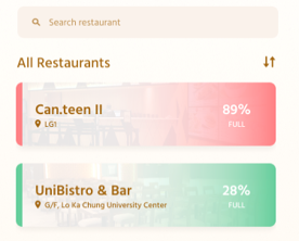
Some of these suggestions were adapted into our final prototype – a mobile that offers full-stack functions for experience in canteens:
- Viewing the real-time status of canteens, like the number of seats and time needed to get your meal
- Choosing canteens, with location and rating services
- Communicating between canteens and university members, by the rating and comment functions, and updates notifications
- Boosting meal ordering with online menu and orders
We were able to integrate several interactive features, such as a search bar and navigation function that allow users to find out canteens’ statuses. Meanwhile, notification systems and reviews act as a channel of communication between users and restaurants. Visual elements such as scrollable lists, pop-up windows, and primary/secondary buttons were considered to make the flow of using the app more fluent and intuitive.

My reflection
This is indeed the very first time for me to be executing systematic processes to come up with a design – to empathize, then to interpret and ideate, and finally to verify. To be honest, it is not my first chance of getting knowledge of the design thinking concept as a whole, yet this project is the first chance for me to work on them in practice. Before, I would say these practices are just adding unnecessary burdens to people who design; but during the project, I can see how they help us get rid of the (improper) mindset of “we know what user needs” and allow us to dig out real users’ need and what may help.
Also, making a decision can be very difficult when it means giving up ideas. At the initial stage, we obtained so many branches but we need to take just one, and as we dived into the smart canteens idea, we had to give up potential solutions in our prototype such as seat reservation as we can see it will involve too many parties and can’t be done easily, making it certainly not low-cost and can take times even just for a prototype. That being said, this project taught me that in designing, there are many real-life factors to consider – we need to adjust (and even give up) plans due to the resources and time we have – we just can’t be too “greedy”.